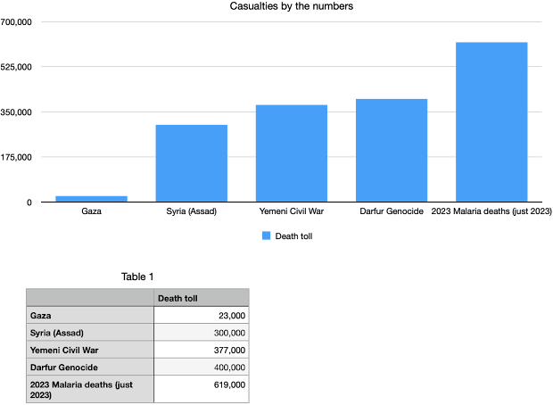
The deaths you see, the deaths you ignore, in visual form
The sources for the other numbers are as follows. The Syria death toll came from a quick search, leading to this Guardian piece. The Yemeni figure came from a more reliable source-- this CFR piece. The Darfur number came from the Holocaust Museum of Houston, although figures vary more given both the time frame and the challenge of counting in the region. Still, this is tragedy and horror on a scale that makes me weep. The malaria number comes from this WHO piece. I always refer to malaria and waterborne pathogens as the sources of death at horrifying scale that are easily avoided and despicably ignored.
Sometimes numbers speak for themselves, and peoples' refusal to respond accordingly? That speaks for itself too.

Comments
Post a Comment